Drone footage exists. Dispatchers can't see it.
Police drones capture aerial intelligence during active incidents, but that footage lives in a separate system, operated by a separate person, on a separate screen. Dispatchers coordinate response across radio, CAD systems, and incident notes while mentally tracking priority and toggling between windows.
OVERWATCH synthesizes live drone feeds, officer positions, and incident data into one interface that matches how dispatchers actually think during incidents. I led research and design for this thesis project across seven Georgia law enforcement agencies.
Role
Lead Designer
UX Researcher
Timeline
Aug 2025 – Apr 2026
(9 months)
Team
Solo project
(MS-HCI Thesis)
Tools
Figma, Leaflet.js
D3, HTML/CSS
"This is the first time I've seen drone footage and officer positions on the same screen. I don't have to ask where everyone is." — Dispatch supervisor, Georgia Tech PD
Research at a Glance
Fragmented Systems, Fragmented Awareness
Users: 911 dispatchers, patrol officers, drone pilots, shift supervisors.
What's at stake: Seconds matter. A dispatcher juggling four systems during an armed-person call can miss a location update or send units to the wrong entrance. Fragmented information creates cognitive load that compounds under stress.
The fragmentation problem: Dispatchers today use CAD for call queue, a separate map for officer positions, radio for real-time updates, and have no direct access to drone feeds. Drone pilots relay what they see verbally. If the dispatcher mishears "northeast corner" as "east entrance," officers approach blind.
This isn't about adding a feature. It's about consolidating existing information into one interface that matches how dispatchers actually think during incidents.
Field Research Across Seven Agencies
30+ interviews with personnel across Atlanta PD, Georgia Tech PD, and Georgia State Patrol. 17 ride-along observations to see dispatch and field operations in real time.
Key Insights
Fragmentation causes overload, not volume
Dispatchers weren't overwhelmed by how much information they handled. They were overwhelmed by how many places they had to look for it. Implication: Consolidation is the design opportunity, not reduction.
Drone footage is trusted but siloed
Officers expressed high confidence in aerial perspective for situational awareness, but frustration that it rarely reached dispatchers who coordinate response. Implication: The interface must surface drone feeds directly to dispatch, not just pilots.
Priority triage is mental, not systemic
Dispatchers keep call priority rankings in their heads because no system shows severity at a glance. Implication: Visual priority indicators (color, position, iconography) could reduce cognitive burden.
10-codes aren't obstacles
Dispatchers are fluent in police shorthand. The interface should speak their language, not translate it. Implication: Use 10-71 (Armed Person), not "Armed Person Alert."
Research Artifacts

Empathy Mapping
Synthesized officer and dispatcher perspectives into a unified empathy map, capturing what users say, think, do, and feel during high-stress incidents.
Personas
Four personas representing the spectrum of patrol officer experience, technology comfort, and operational context. These informed design decisions around information density, voice interaction, and threat assessment features.
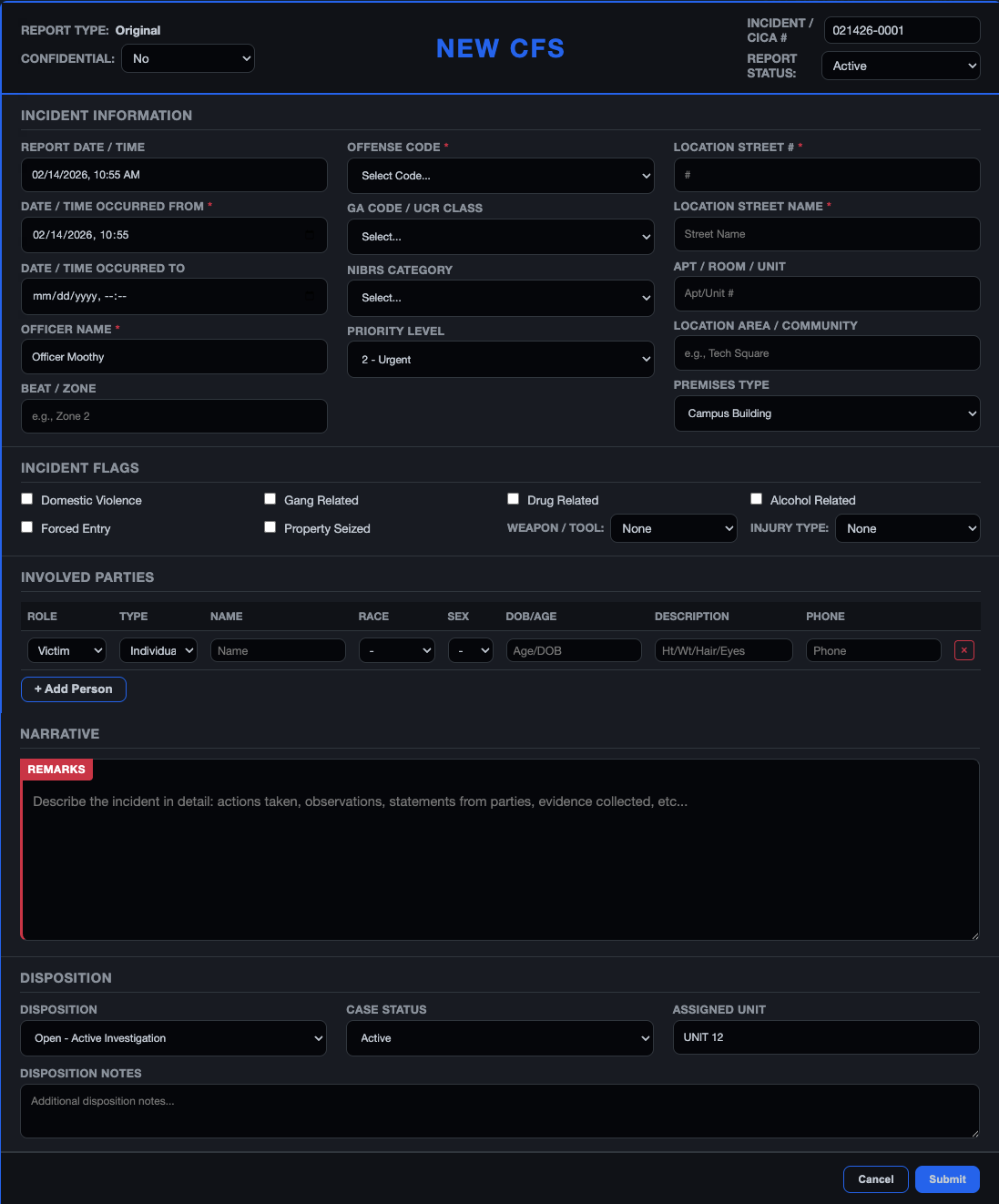
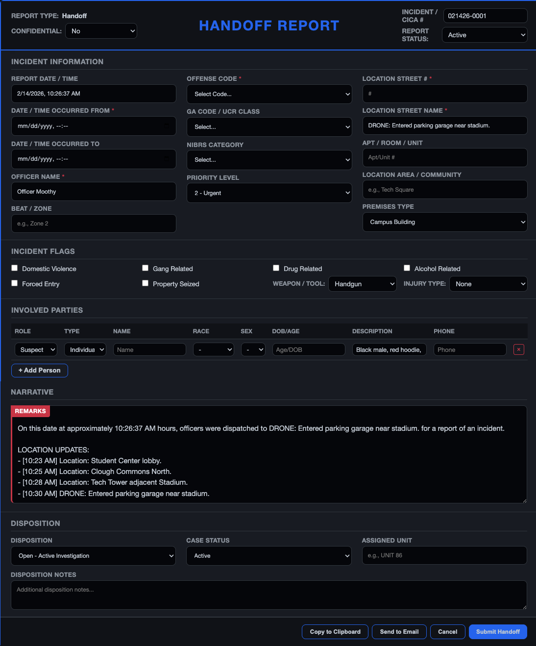
OVERWATCH: Three Columns, One View
A three-column dashboard designed for high-stress, time-critical scenarios. Each panel serves a distinct operational purpose, and placement reflects how officers naturally scan during incidents.
Information Hierarchy: Single Pane of Glass
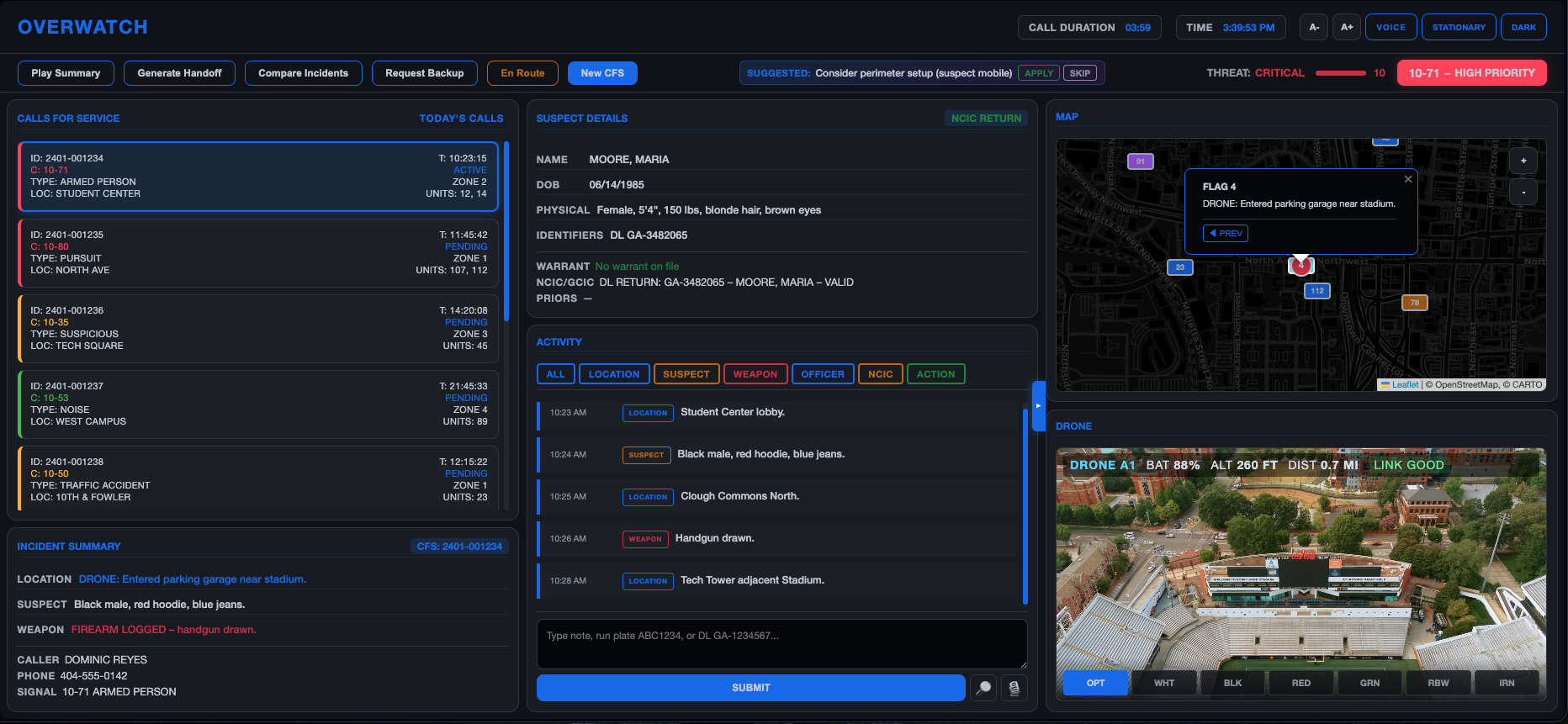
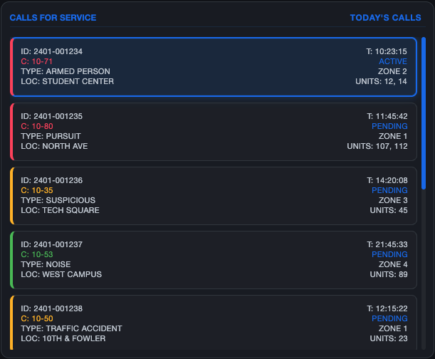
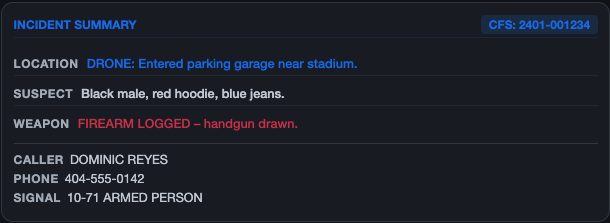
Left: Calls & Incident Summary
Priority-sorted call queue with color-coded severity. Incident cards match radio briefing order (location → suspect → weapon).
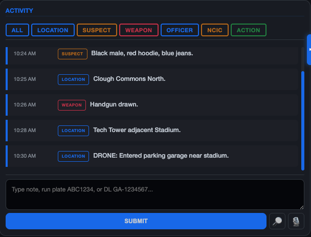
Center: Activity & Suspect
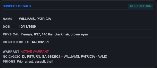
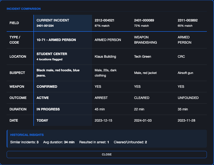
Unified activity stream with voice dictation and natural language queries. Suspect panel shows warrant status and prior contacts.
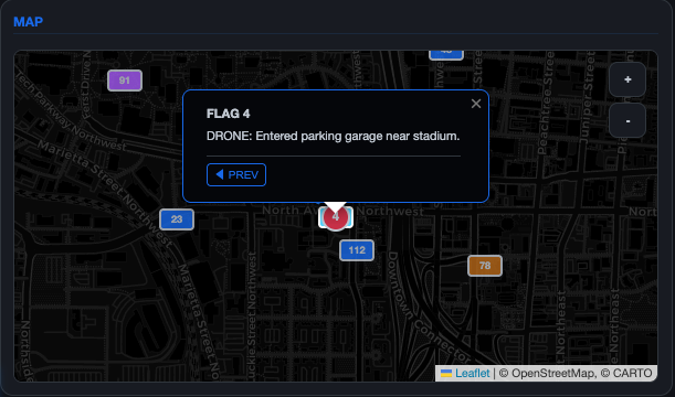
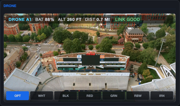
Right: Map & Drone
Real-time officer positions adjacent to live drone feed. Thermal palettes for night and concealment scenarios.
Header: Threat & Controls
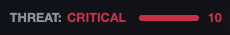
Persistent threat indicator (1-10 scale) with mode toggle. Driving mode collapses non-essential panels.
Interface Components
Each panel solves a specific problem. Use the arrows to explore the design decisions behind each component.
Login Screen
The session begins with operator identification. This screen gates access and ties all subsequent actions to a named officer for audit trails and research logging.
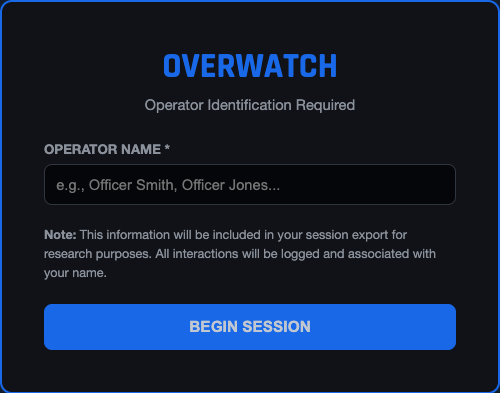
Operational Workflow
- Officer enters their name before the session starts
- All interactions are logged and associated with this identifier
- Session data can be exported for after-action review
Design Decisions
- Single required field reduces friction at shift start
- Blue accent border signals system readiness
- Research disclosure is upfront and transparent
Example: Officer Martinez begins her shift by entering her name. The system logs her session start time (08:00) and will attribute all notes, queries, and status changes to her badge for the supervisor's shift report.


Design System
A dark, utilitarian interface system built for high-stakes dispatch environments. Every decision optimizes for rapid threat scanning, night-shift legibility, and zero ambiguity under stress. No decorative elements, no sci-fi chrome.
Color System
Dark backgrounds reduce eye strain during 12-hour shifts. Priority colors are WCAG AA compliant and distinguishable for colorblind operators.
Background Surfaces
--bg-input
--bg-primary
--bg-panel
Priority Colors
Critical
Warning
Action
Resolved
Typography
Helvetica Neue throughout the interface. Clean, legible, and optimized for rapid scanning under stress.
Display / Helvetica Neue Bold
OVERWATCH
Body / Helvetica Neue Regular
Unit 42 responding to 10-50 at North Ave. ETA 3 min.
Data / Helvetica Neue Medium
CFS-2024-0847 | 14:32:07 | 10-50PI
Key Design Decisions
Information hierarchy: The primary challenge was determining what information deserves screen real estate. Through testing with dispatch staff, I established: calls and incident (left), activity and suspect (center), map and drone (right). This matches the dispatcher's mental model: "What's happening? Who's involved? Where is everyone?"
Alert escalation: Three-tier system: Priority 1 (red) for immediate threats, Priority 2 (amber) for developing situations, Priority 3 (blue) for routine calls. The system suggests drone deployment for Priority 1 incidents, but dispatchers can override. The threat score is algorithmic but not authoritative.
Speak their language: The interface uses 10-codes (10-71, not "Armed Person Alert") because dispatchers are fluent. Translating to plain English would slow them down and feel patronizing.
Priority States: Color-Coded Response System
Immediate Threat (Red)
Auto-triggers drone deployment, escalates to supervisor
Developing Situation (Yellow)
Monitored status, drone available on request
Routine Call (Blue)
Standard dispatch, no aerial support needed
Closed Incident (Gray)
Archived for reporting and analysis
Validating with Real Officers
I conducted mixed-methods evaluation combining expert-based and user-based approaches: heuristic evaluation, cognitive walkthrough, and task-based usability testing with 10 sworn patrol officers from Georgia Tech Police Department.
Methodology
Task-Based Testing
Officers completed 5 core tasks: reviewing calls, tracking suspect movement, marking status, interpreting threat panels, and generating handoffs.
Semi-Structured Interviews
30-45 minute sessions capturing perceptions of information needs, current dispatch frustrations, and desired changes.
System Usability Scale
Standard 10-item SUS questionnaire to quantify perceived usability after task completion.
NASA TLX Workload
6-dimension workload assessment: mental demand, physical demand, temporal demand, performance, effort, frustration.
Quantitative Results
Per-Officer SUS Breakdown
Individual scores ranged from 73 to 82, with officers consistently describing OVERWATCH as "the best CAD interface I've seen."
82
Officer Bittner
80
Officer Bidgood
80
Officer Sarr
78
Officer Martial
75
Officer Bohr
73
Officer Parrish
What Officers Said
"Best CAD I have seen. The map and breadcrumbs alone would change how I approach pursuits."
— Officer Bittner, SUS 82
"It's like having a personal dispatcher. I can see everything without asking for it over radio."
— Officer Sarr, SUS 80
"The activity stream is what I'm doing in my head anyway. This just shows it."
— Officer Martial, SUS 78
NASA TLX Workload Profile
Officers reported moderate overall workload, with mental and temporal demands inherent to patrol work. OVERWATCH shifted cognitive load away from reconstructing events toward monitoring and decision-making.
Validation & Impact
This is thesis research, not a shipped product. Honest assessment of where it stands:
Prototype testing: 10 sworn officers completed task-based usability sessions. Mean SUS score of 78 indicates good usability, with officers consistently rating OVERWATCH above their current CAD tools.
Agency interest: Georgia Tech Police Department expressed interest in continued collaboration for pilot testing. The research contributes to HCI literature on emergency response interface design.
What I can't claim: Hard metrics on response time or error reduction. Those require deployment and measurement that thesis timelines don't allow.
"This is significantly better than our current CAD. The map alone would change how we coordinate on pursuits." — Officer Bittner, GTPD
What I Learned
-
Users don't want new features. They want fewer systems.
The instinct is to add capabilities. The insight was that consolidation creates more value than innovation. Dispatchers didn't need a new tool. They needed their existing tools to talk to each other.
-
Domain fluency is non-negotiable.
I couldn't design for dispatchers until I understood 10-codes, CAD workflows, and the rhythm of a shift. The ride-alongs taught me things interviews never could. You have to be in the room when it's happening.
-
Every interaction must be immediately clear under stress.
There's no room for "figure it out" in emergency response. This discipline now shapes how I approach all interface work: if it requires a second look, it's wrong.
What I'd Do Next
- Run A/B testing on information hierarchy to validate the three-column layout against alternatives
- Integrate with actual CAD and AVL systems to move from prototype to pilot
- Expand research to 911 call-takers, who sit upstream of dispatchers and have different information needs