Data Physicalization: translating campus safety data into a tactile textile interface
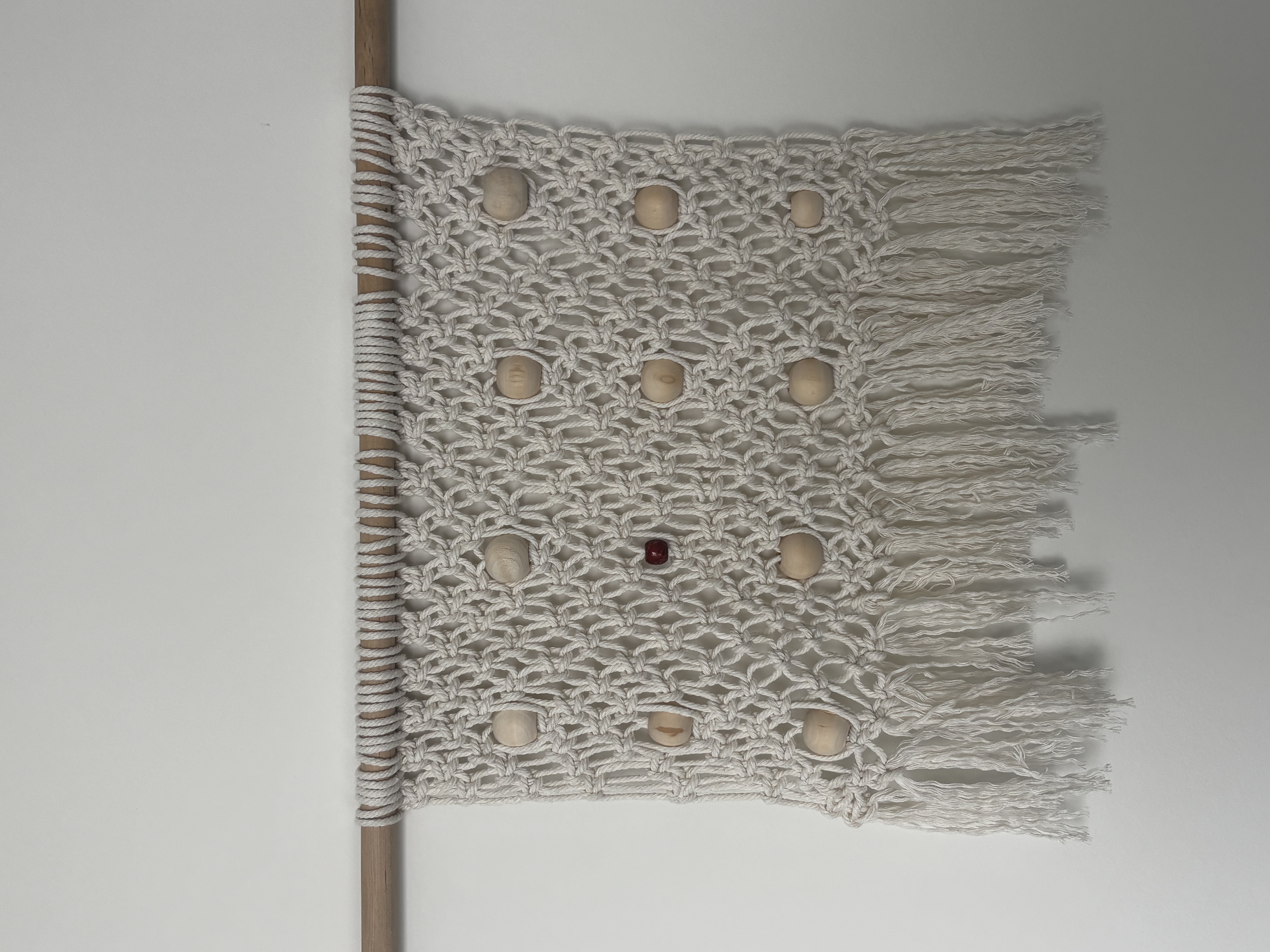
A hand-knotted macramé panel that translates GTPD's published safety reporting into knot density and bead placement, exploring how data might be read through touch instead of sight alone. This is Study 01, the foundation for an ongoing series on tactile interface primitives.
Bridging digital UX and physical material engineering
This project converts abstract campus safety data into a physical, touchable object — proof that UX principles like hierarchy and affordance transfer directly into material systems.
Using macramé, a knot-based fiber structure, I built a woven panel that encodes incident data through knot density, bead placement, and material contrast. The result is a tactile interface: something you read with your hands, not just your eyes. It's a bridge between the two disciplines I want to combine — digital experience design and bespoke physical craftsmanship.
Flat maps are functional. They aren't felt.
A digital crime map compresses risk into color gradients and dots. It's efficient, but disposable — glanced at, scrolled past, abstracted from the body that actually has to walk through that space. It asks for visual attention and rarely asks for physical engagement.
The UX insight driving this project: intuition is multisensory. People build spatial understanding through touch, proximity, and repetition, not just sight. A woven object you run your hands across creates a slower, more embodied relationship to information than a map you scroll past.
So instead of asking how to visualize the data, I asked how to let someone feel it — encoding severity and frequency directly into knot type, bead scale, and color contrast, so reading the data becomes a physical, almost narrative experience.
Materials and structure
- Base structure — cotton cord, hand-tied with spiral knots, square knots, and mesh patterning
- Mounting — natural wood dowel, suspended cord wrap
- Data markers — wooden beads for high-frequency events, one dyed red bead as a high-severity anchor
- Method — knot studies developed by hand first, then translated into a digital grid to control spacing, alignment, and repeatability, preserving tactile character while gaining computational precision over placement
What the knots represent structurally
The woven mesh functions as a coordinate system. Each knot intersection is a nodal point a bead can be seated into, turning the textile into a grid onto which categorical data can be pinned. The continuous woven field ties every data point into one connected system, rather than isolated markers on a blank background — mirroring how incidents on a real campus exist within a connected geography, not in isolation.
The data coding system
| Element | Count | Represents |
|---|---|---|
| Standard wood beads | 11 | High-frequency property crime (bicycle theft) |
| Red accent bead | 1 | High-severity incident anchor (assault-category incidents) |
GTPD publishes two different records, and it's worth being precise about which one this piece draws from. The Daily Crime Log covers incidents reported within GTPD's jurisdiction, logged with incident type, report date, occurrence date, general location, and disposition, with downloadable annual data available through 2025. The Annual Security and Safety Report, the Clery Act disclosure, is a separate document that summarizes three years of specified crime statistics campus-wide. This project draws its bead counts from the Daily Crime Log, not from the Clery statistics.
Methods note: I reviewed GTPD's 2025 crime-log data, filtered incidents by [location and date range], and grouped them into categories. I then reduced the dataset to 11 bicycle-theft markers and one assault-category marker for this material prototype. [Placeholder: fill in the exact date range and any additional filters you applied before publishing, so this note matches your actual process.]
The logic is intentional, not decorative. Frequency maps to repetition: common incidents get a repeated, evenly distributed bead, so density communicates volume by touch the way a bar chart would by sight. Severity maps to contrast: the single red bead breaks the pattern, findable without looking, the same hierarchy a UX designer builds with a single accent color, expressed here in material instead of pixels.
Where this methodology could go next: bespoke automotive interiors
This project is a proof of concept. The next step I want to explore is bringing this data-to-textile methodology into bespoke automotive interiors, a space where materials already carry meaning. Ferrari's Tailor Made 12Cilindri for the South Korean market is a real example worth studying: artist Dahye Jeong's traditional horsehair weaving became a newly developed 3D fabric on the seats and soft surfaces, plus a hand-woven Mongolian horsehair artwork built into the dashboard. Separately, artists GRAYCODE and jiiiiin translated the V12's acoustic character into a visual livery painted across the exterior bodywork, not a 3D-printed texture, a graphic trace of sound rendered in paint rather than surface geometry.
These are conceptual directions for future design studies, not manufactured or client-commissioned work.
Narrative textiles
Cultural and material history, like the horsehair weaving in the Ferrari example above, woven directly into performance seat trim. Knot density and placement could reflect provenance, craft lineage, or an owner's history, encoded structurally rather than printed on.
Acoustic data visualization
Ferrari rendered a V12's sound as a painted graphic. I'm curious what happens if that same acoustic signature gets translated into knot rhythm and embroidery instead, something felt in the surface of the interior rather than only seen on the body.
What this proves
Translating abstract data into physical, sensorial systems — not just charts, but touchable objects with real informational hierarchy.
Working across craft and computation — hand-built knot studies refined through a digital grid, balancing tactile authenticity with precision.
Understanding material as an interface — knot type, bead scale, and color function as UI elements in a physical medium.
Designing coding systems that scale — this bead/knot grammar could be re-applied to new datasets and new contexts, automotive trim included.